
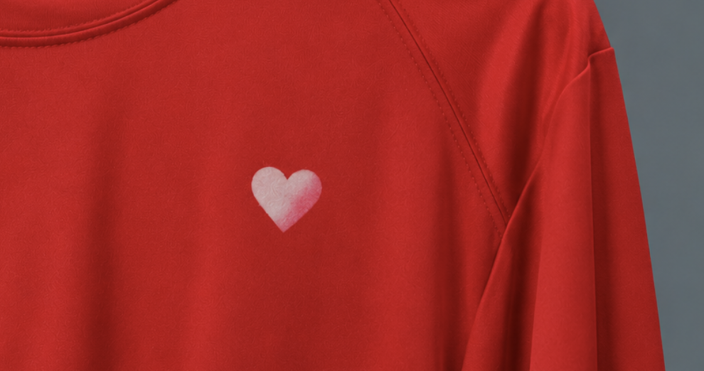
The white logo was perfect. The shirt was red. Everything looked exactly as it should—until the logo started turning pink.
There’s a particular kind of mystery that can make even an experienced print shop stop and look twice.
A red polyester shirt comes off the press with a beautiful white logo. The edges are crisp. The coverage looks solid. The color is exactly what the customer approved.
No smudges, missing details, and obvious problems.
Case closed, right?
Not quite.
A little later, someone notices something strange.
The white isn’t quite white anymore.
At first, it’s barely noticeable. Maybe the logo has a faint blush of pink. Maybe it’s just the lighting.
But the next time someone looks, there’s no denying it.
The logo is changing color.
Nobody touched the artwork. Nobody asked for a new shade. And the printing team certainly didn’t decide that pink would look better.
So, who changed the color?
Welcome to Case #002 of The Print Problem Files, where we investigate the mysteries, mistakes, and science behind apparel printing.
Today’s suspect is particularly sneaky because the problem doesn’t always reveal itself while the shirt is being printed.
Its name? Dye migration in screen printing.
And if you’ve ever wondered why printing on polyester requires a little extra detective work, you’re about to find out.
The Crime Scene: A white logo that wouldn’t stay white
Let’s return to our red polyester shirt.
Imagine it’s part of a uniform order for a landscaping company. The team spends long days outdoors, so lightweight, moisture-wicking performance shirts seem like a sensible choice.
The company wants its logo printed in white. Simple, clean, easy to recognize.
On paper, everything works.
Red shirt. White logo. Done.
But there’s something about polyester that makes this job different from printing the same design on a traditional cotton shirt.
Polyester garments are commonly colored using disperse dyes. These dyes are designed to work with synthetic fibers, and under certain conditions, some of that color can move from the garment into the printed decoration.
That’s where our mystery begins.
The red dye doesn’t necessarily stay confined to the red fabric.
Under the right conditions, it can migrate into the white ink sitting on top.
And suddenly, the white logo starts looking pink.
The most frustrating part?
The print may have looked perfectly fine when it first left the press.
That’s what makes dye migration such an interesting—and occasionally expensive—problem.
The evidence sometimes appears after the printing is finished.
Suspect #1: The dye that refused to stay put
Before we point fingers at the ink, we need to understand what’s happening inside the shirt.
Polyester and cotton may both look like ordinary fabric, but their chemistry is quite different.
Cotton is a natural cellulose fiber. Polyester is synthetic, and its dyes behave differently when exposed to heat.
Many polyester garments are colored with disperse dyes, which are well suited to the fiber’s structure.
Here’s where things get interesting.
When polyester is exposed to elevated temperatures, dye molecules can become more mobile. Depending on the dye, fabric, temperature, and decoration system, some of those molecules can move out of the fibers and into compatible printing materials.
This movement is known as dye migration.
Think of it this way.
Imagine putting a white paper towel against a surface that looks completely dry, only to discover that some color can still transfer under the right conditions.
The color was there all along.
It simply found a way to move.
With polyester printing, the process is more complex than that analogy, but the result can look surprisingly similar.
A clean white print begins picking up color from the garment underneath.
And because white ink provides such a dramatic contrast against darker fabrics, even a relatively small amount of dye contamination can become noticeable.
That’s why white designs on red, maroon, or other strongly dyed polyester garments can be especially revealing.
The logo isn’t necessarily fading.
It’s being stained from underneath.
And that’s an important distinction.
Suspect #2: The accomplice nobody suspected
Now for the plot twist.
Heat is essential to many apparel decoration processes.
It helps cure inks, bond transfers, and produce prints that can survive regular wear and washing.
Without the right heat, a decoration may not adhere or cure properly.
But with certain polyester garments, heat can also encourage dye movement.
So, the same production factor that helps make a print durable can create another problem if the materials aren’t compatible.
Talk about a complicated relationship.
When curing becomes part of the investigation
In screen printing, ink needs to reach the curing conditions specified for that particular formulation.
For many conventional plastisol inks, this involves elevated temperatures. However, not every ink cures at the same temperature, and the dryer’s displayed setting isn’t necessarily the temperature reached by the ink film.
Now consider a polyester shirt containing dyes that are sensitive to heat.
If the garment is exposed to temperatures that encourage dye migration, some of that dye may begin moving toward the print.
The result might not be visible immediately.
A shirt can look beautiful right after curing and develop discoloration later as the dye continues moving into the ink.
This is why dye migration in screen printing can be so deceptive.
The evidence may not appear until hours or days after production.
Does that mean lower heat is always better?
Not exactly.
Simply lowering the temperature without considering the ink’s requirements can create an entirely different problem: undercuring.
An undercured print may crack, wash away, or fail to perform as expected.
The goal isn’t to use as little heat as possible.
The goal is to use a compatible ink and garment combination, then apply the correct curing conditions for that system.
That might involve selecting a low-cure ink formulated for polyester, adjusting production settings within the manufacturer’s specifications, or choosing a different decoration method.
The important part is understanding that temperature isn’t just a number on a machine.
It’s part of the chemistry of the finished product.
Suspect #3: The fabric that looked innocent
Here’s another clue worth investigating.
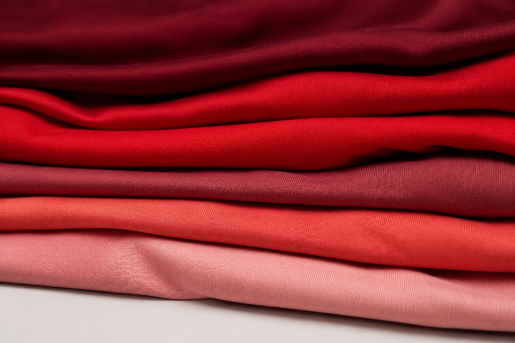
Not all polyester shirts behave the same way.
Two garments can look almost identical, feel equally lightweight, and carry the same general fabric description—yet respond differently during printing.
Why?
Because polyester isn’t a single, perfectly predictable material.
Different garments may use different dyes, dyeing processes, finishes, constructions, and blends.
Some polyester fabrics are more prone to dye migration than others.
Certain sublimated garments can present additional challenges because their colors are created using dyes that may become mobile again when exposed to heat.
And even within the same color family, one shirt may print beautifully while another needs extra precautions.
The mystery of the identical-looking shirts
Picture two red performance polos sitting side by side.
Both are polyester, intended for outdoor employees, and need the same white company logo.
One is decorated using a compatible printing system and remains bright white.
The other develops a faint pink tint.
It’s tempting to assume the second print was simply done incorrectly.
But without examining the materials and production conditions, that conclusion would be premature.
The garments themselves may have different dye-migration characteristics.
That’s why fabric selection matters long before the first shirt reaches the press.
This is one of the reasons we believe apparel decisions should begin with how the garment will actually be used—not just how it looks in a catalog.
A performance shirt for a Florida landscaping crew has different demands from a cotton tee for a weekend event.
The fabric needs to work for the wearer.
And the decoration needs to work for the fabric.
Both matter.
The Evidence: How to recognize dye migration
So how do you know when dye migration is the culprit?
Like any good investigation, we need to examine the evidence.
Dye migration in screen printing often leaves recognizable clues, although appearance alone cannot confirm the cause.
| Evidence | What it might suggest |
|---|---|
| A white logo develops a pink or reddish tint | Red garment dye may be migrating into the print |
| Discoloration appears after printing rather than immediately | Dye movement may be continuing after heat exposure |
| Light-colored areas change more noticeably | Migrating dye is easier to see against light ink |
| The print remains intact but its color changes | Staining may be occurring rather than ordinary print wear |
| Only certain garments or fabric styles are affected | Differences in dye chemistry or fabric construction may be involved |
One particularly useful clue is the difference between fading and color contamination.
If a print is fading, the original color may be losing strength because of abrasion, washing, chemical exposure, or another durability issue.
If dye migration is occurring, the printed layer may remain physically intact while unwanted garment color enters it.
The logo is still there.
It’s just no longer the color it was supposed to be.
And that changes how the problem should be investigated.
The Plot Twist: Why more white ink isn’t always the answer
Let’s say you’ve discovered the problem.
The white logo is turning pink.
What’s the solution?
Print another layer of white ink?
It sounds reasonable.
After all, if the white isn’t bright enough, shouldn’t more white solve the problem?
Unfortunately, dye migration isn’t always a coverage problem.
It’s a movement problem.
Adding more conventional white ink may temporarily improve opacity, but it doesn’t necessarily prevent dye molecules from traveling into the printed layers.
In some cases, the discoloration can continue.
That’s where specialized printing technologies enter the investigation.
Enter the dye blocker
Dye-blocking inks and barrier systems are designed to help reduce the movement of garment dyes into the visible print.
Depending on the application, a decorator might use a specially formulated low-bleed ink, a dedicated barrier underbase, or another system designed for polyester.
The purpose is straightforward: Keep the garment’s color from contaminating the decoration
Some systems use pigments or barrier technologies intended to inhibit dye migration. Others combine lower curing temperatures with formulations engineered for synthetic fabrics.
However, no single solution is guaranteed to work with every polyester garment.
Different dye types, garment constructions, and heat exposures can produce different results.
That’s why testing remains important, even when a product is marketed as low-bleed or dye-blocking.
A blocker is a useful tool.
It isn’t a magic spell.
And in a mystery involving chemistry, assuming you’ve solved the case without testing is a good way to end up with a sequel nobody wanted.
What about DTF transfers? Can they turn pink too?
This is where the investigation gets even more interesting.
Screen printing isn’t the only decoration method that can encounter dye migration.
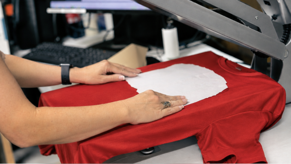
Direct-to-film (DTF) transfers also involve heat, pressure, adhesives, and printed layers.
When a transfer is applied to certain polyester garments, heat can encourage dye movement. Depending on the garment and transfer system, that movement may cause discoloration in the transferred design.
A white section of a DTF graphic, for example, may develop an unwanted tint.
This doesn’t mean DTF is unsuitable for polyester.
It means the transfer system needs to be compatible with the specific garment.
Specialized low-temperature application systems and dye-resistant transfer materials can help manage the risk.
But as with screen printing, compatibility testing is essential.
And what about embroidery?
Because embroidery uses thread rather than a printed ink film, it doesn’t experience dye migration in the same way as screen printing or heat transfers.
That can make it an appealing option for certain polyester polos, jackets, and professional uniforms.
However, embroidery has its own considerations, including garment stability, stitch density, design complexity, and thread selection.
There isn’t one decoration method that wins every case.
The best choice depends on the garment, the design, the intended use, and the performance requirements.
The Investigation: How print shops help prevent dye migration
Now that we know the suspects, let’s talk about prevention.
Because while dye migration can be frustrating, it’s also a well-recognized challenge in apparel decoration.
Experienced decorators don’t have to wait for a white logo to turn pink before thinking about it.
They can evaluate the risks during planning and production.
1. Start with the garment, not just the artwork.
A good production conversation should consider more than logo placement and print size.
What fabric is being used?
Is it 100% polyester or a blend?
Is the garment sublimated?
Will the shirt be exposed to demanding conditions?
These questions help determine which decoration options are worth considering.
For example, a red polyester performance shirt may need a different printing approach from a white cotton event tee.
The artwork might be identical.
The production strategy shouldn’t automatically be.
2. Choose inks and transfers designed for the application.
When printing on polyester, specialized low-bleed inks, dye-blocking systems, or compatible transfer materials may be appropriate.
The right solution depends on the garment and decoration method.
A standard ink that works beautifully on cotton may not be the best choice for a dye-sensitive polyester shirt.
Choosing the right materials from the beginning can help avoid surprises later.
3. Control the heat carefully.
Temperature, time, and pressure should be matched to the decoration system and garment.
For screen printing, that includes verifying the ink reaches its required cure conditions.
For heat transfers, it means following the applicable instructions for temperature, pressure, dwell time, and peeling.
Using the correct settings is about more than making the decoration stick.
It’s also about avoiding unnecessary heat exposure while achieving proper adhesion or cure.
4. Test before committing to the full order.
This is one of the most valuable steps in the entire investigation.
A production sample can reveal compatibility issues before a larger quantity of garments is decorated.
And because dye migration may not appear immediately, checking only the moment a shirt leaves the press may not be enough.
Depending on the system, a decorator may allow time for delayed discoloration and conduct additional testing under appropriate conditions.
A sample that looks good immediately is encouraging.
A sample that remains stable after an appropriate evaluation is more meaningful.
5. Consider the full life of the garment.
A shirt isn’t finished serving its purpose when the printing is complete.
It still has work to do.
It may spend hours in the Florida sun, get washed repeatedly, sit in a hot vehicle, or become part of an employee’s weekly uniform rotation.
Those real-world conditions matter when choosing both garments and decoration methods.
The goal isn’t simply to produce something attractive on day one.
It’s to choose a combination that can perform as expected throughout normal use.
Why this matters more than you might think
Let’s zoom out for a moment.
Because this isn’t really just a story about a red shirt and a pink logo.
Imagine ordering 75 new performance shirts for your team.
The design looks great.
Everyone gets their size.
The uniforms go into rotation.
Then, a short time later, someone notices the white logo isn’t white anymore.
Now there’s a conversation nobody planned to have.
Do the shirts need replacing?
Will the next batch have the same issue?
Was the problem with the garment, the decoration, or the production process?
And how do you prevent it from happening again?
For a business, a printing problem can quickly become a scheduling problem, a budget problem, and an inconvenience for the people wearing the uniforms.
That’s why thoughtful apparel planning matters.
It isn’t about making every order unnecessarily complicated.
It’s about asking the right questions early enough to avoid preventable surprises.
Sometimes that means recommending a different ink system, or testing a particular fabric, or choosing a different decoration method altogether.
And sometimes the best solution is simply selecting a different garment.
Not because the original choice was bad.
But because a better match exists for the job.
Case Closed: The color didn’t change on its own
Let’s return to our original mystery.
A red polyester shirt. A perfectly white logo. And a surprise appearance by the color pink.
So, who changed the color?
The evidence points toward a process that can occur when certain garment dyes become mobile and move into a printed decoration.
Heat may have helped set the stage.
The fabric’s dye chemistry may have made the movement possible.
And an incompatible decoration system may have left the print vulnerable.
The lesson? A great print depends on more than great artwork.
It depends on understanding how the garment, dye, ink, and production process work together.
At Morningstar, we believe the details behind a print deserve just as much attention as the design everyone sees.
Whether you’re outfitting an outdoor crew, refreshing company polos, or planning your next batch of branded apparel, we’re here to help you make thoughtful choices about what goes on your garments—and how it gets there.
Because your brand colors should be memorable.
Just not for changing without permission.
Planning a new apparel order? Let’s talk about the right garment and decoration combination for your team.
Case #002: Closed.
Next in The Print Problem Files: Another mystery from behind the press.